What is the purpose of a logo? In general terms, it exists in order to be readily identifiable with an organisation: it is the immediate visual identity where the public is concerned. Furthermore, it conveys attributes of the organisation and these in turn support attributes inherent to the brand.
These sorts of explanation, replete with reference to the brand, are applicable in the business world. Logos can be big business and attract big dollars (or any other currency). I have some recollection, for example, about Wolff Olins once getting an absolute stack for coming up with a new-look British Airways logo.
The world's leading logos are highly recognisable. Take Apple for example. Or Nike. While recognisable and memorable, it's a matter of conjecture as to what they actually "say" about the brand or company. The same can be said for Coca-Cola, McDonald's, Google. They are very, very well-known, but do they mean anything to the average punter other than being instantly recognisable?
Marketing speak is what explains to us the purpose of the logo. And businesses are, in essence, all about marketing. The logo is thus essential, because marketing has deemed it to be so, regardless of how meaningful or not it might actually be. So we get the whole deal with logos where businesses are concerned. But what about governments?
One of those very well-known logos, Google, was to whom I turned to enquire of it the purpose of government logos. After three pages didn't reveal any obvious answer, I gave up, stopping only to check out Japan's Ministry of Health, Labour and Welfare. Helpfully in English, it explained that the logo was to "enhance the ministry’s corporate governance and to bring about a change in the staff’s mindset, by returning to the original purpose of the government services on health, labour and welfare that meet the public expectations".
Here, at any rate, was some clue as to purpose, if only in the Japanese health ministry.
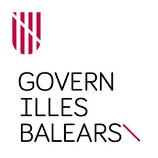
My reason for asking Google was that, and you are almost certainly unaware of the fact, the Balearic government has a new logo. You will be reassured to learn that this didn't cost top dollar (euro). Only 9,000 euros have been handed over to a Mallorcan designer Lluis Llabrés, of whom we learn that he has worked with "foreign" governments and chef extraordinaire Ferrà Adriá. And what has he come up with? Well, it's a shield, similar to one that has hitherto featured but in a sort of reddy-mauve colour with a diagonal white stripe. Underneath this is "Govern Illes Balears" in a suitably minimalist typeface and then a further stripe but in that mauve colour (I think red-violet might be what a swatch would tell us).
To be honest it looks like something that would be on a football shirt. There is in fact a vague resemblance to Stoke City's badge without any reference to "The Potters", which is probably just as well.
Why, you might ask, has the government felt the necessity for it have a new logo? You will not be surprised to learn that one reason is because the previous one dates from the time of disgraced ex-president Jaume Matas. (One wonders how much that cost, but let's not go there.) Otherwise, there is a practical reason. The Matas version with more heraldic-style shield was multi-coloured. The new one will mean savings on printing costs, which is fair enough.
But then we get to the guff. Greater sustainability might be afforded through less strain being placed on printers' inks, but what do we make of the two colours - the red-violet one and what is basically black - being colours "sustainable and extracted from fruits cultivated on the islands"? Eh? Perhaps this is a reference to certain types of fig. Otherwise, who can say.
Moreover, the new design is "much closer and more open to the citizenship", and the citizens - in an era of digital communications - will be better able to understand it. Perhaps the citizens will be, but the Partido Popular isn't convinced. Why is the government spending nine grand on a new logo when it has vowed that a key objective has been the "rescue" of the citizens? This was a question from the PP's Marga Prohens, who was clearly unaware that this rescue is partly being aided by a logo that is more understandable to them.
But then the PP also wanted to know why it looks like the logo of the Generalitat de Catalunya, which in a way it does, except for the shape, which is football-club shield-shaped.
Will the citizens now all identify with this logo? Will it explain the attributes of the government? Will it encourage loyalty? How can one possibly say? What is the purpose of a government logo? Only the Japanese seem to know.
Subscribe to:
Post Comments (Atom)


No comments:
Post a Comment